Hennie Haworth & James Hancock
Wet & Dry Typography
This is my 1 of my wet typography experiments, i spelt out my name using masking tape & sticking it onto the paper. this was quite hard because i had to rip up smaller bits to create the bends in the letters. I then painted over the masking tape with water colours, i used a variety of different bright colours just as do Hennie Haworth & James Hancock. I then gently pealed off the masking tape which proved difficult as i ended up ripping some of the paper up on 1 of my letters. to avoid this next time i would make sure the masking tape is less sticky. once i removed the masking tape i was left with white letters of my name on coloured backgrounds, this looked very plain so i decided to get some ink and design some patterns in 3 of my letters i think this help make the experiment look more unique.
this was my first hand drawn dry typography experiment, i used coloured pencil & felt pens. i tried to include in this piece as many different interesting fonts as i could, i even tried to experiment with what colours went well with each other as a pair. i think the felt pen experiments looks better as it is bolder & the colours are much more vibrant than the coloured pencils. if i was to do this experiment again i would just use felt pens & leave out the coloured pencils because they don't mix well together. i also think i should have used more patterns in the fonts rather than just the letters, i think i should have decorated them more, as Hennie Haworth & James Hancock's' work both make the fonts of the letters interesting by the patterns and decoration they use.
 this was my second hand drawn typography experiment, i used black fine liner pen. again i tried to use different fonts for each letter, i even tried a 3D approach. i think the outlining of the letters helped make them look bold & stand out, i think the diagonal lines in the letter H help to emphasise the letter as its very eye catching. i think i need to improve on the 3D letter as i don't think i completed it to the best of my ability. i also think that although the black fine liner is effective that they would of looked better if bright colours were included into the fonts.
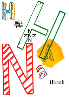
this is my third & final hand drawn dry experiment, in this on i used stencils for the felt pen letters & i also used transfers. i experimented with size, colour, background, direction, position & pattern in this piece. i also looked at capital & lowercase letters and how the arrangement of them could be effective. if i was to try this again i would continue my experiment with the background colours as i don't think the orange & green go very well together. i would also look into the repitition of the letters because i think this looks really effective especially if you use different colours that all go together, i think it would be a good idea to start off with a darker shade of 1 colour and get lighter as you go through.


No comments:
Post a Comment