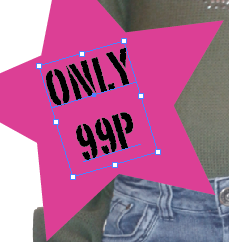
Sunday 24 February 2013

Holiday work

Propaganda Posters

They used propaganda posters in the war to get their people to believe in whatever morals the government felt was right. Propaganda is a form of communication that is aimed towards influencing the attitude of a community toward some cause or position by presenting only one side of the argument. Propaganda is usually repeated and dispersed over a wide variety of media in order to create the chosen result in audience attitudes.

As opposed to impartially providing information, propaganda, in its most basic sense, present information primarily to influence an audience. While the term propaganda had acquired a strongly negative connotation by association with its most manipulative and jingoistic examples e.g Nazi propaganda used to justify the Holocaust. Propaganda in its original sense was neutral, and could refer to uses that were generally benign or innocuous, such as public health recommendations  signs encouraging citizens to participate in a census or election, or messages encouraging persons to crimes to law enforcement, among others.


Thursday 14 February 2013

Matt W Moore Typography Analysis


Context

Matt W Moore created this piece of typography work, he's the founder of MWM Graphics, a design and illustration studio based in Portland, Maine. Matt works across disciplines, from colourful digital illustrations in his signature 'Vectorfunk' style, to freeform  'Watercolour Paintings', and massive 'Aerosol Murals'. MWM exhibits his artwork in galleries all around the world, and 'Collaborates' with clients in all sectors. Matt is also the Founder of 'Core Deco' and Co-Founder & Designer for 'Glyph Cue Clothing'. The piece is a typography piece on the alphabet. He was born in 1980 and graduated from Maine college of art in 2005 with a BFA in Graphic Design & New Media, but has also attended Boston University, Savannah college of art and design, and Rhode Island school of design for other courses of study.

Meaning

I looked at several websites which contained information about Matt W Moore and from them i found out about other business's and work he had partnerships in and looked at them websites too. I think the idea of this work was to use bright colours and different shapes to create the alphabet this work is different and makes the normal alphabet more interesting to look at. The title of the piece is 'Alphafont2' so it tells us that the piece is going be on the alphabet and look at different fonts. It seems he's trying to represent the alphabet in a fun and colourful way.

Aesthetics

I think he could have used photoshop and illustrator to create this piece as it does look very digital as all the lines are straight and smooth and all the shapes are the same. The letters have mostly all been layered and include different shapes and colours to make each letter unique. You can clearly identify each letter although they are all abstract. His use of colour makes the piece interesting to look at and would be eye catching from a distance, i think this piece would be good if it was used on an education poster.

Personal Response


 I chose to look at this piece because I'm looking at typography, I think this piece is bright and colourful and obscurity of the alphabet  using over lapping of shapes and colour. Some of the letters would not make sense out of context and would not be able to identify them but in the piece you can clearly identify each letter. I like the brightness of the piece is and the theme reminds me of the 90's, I think some of the letters could be seen on shop signs, leaflets
and logo's. I think i will look at the alphabet and the different fonts, colours and shapes you can include in to it, i think the obscurity of the letters would also be something to develop.

The letter T from this piece reminds me of the tetris game with the square blocks and colour.


Sunday 10 February 2013

in depth typography analysis

Anna Garforth 'Grow'


Context
The artist that created this piece of work is Anna Garforth, she's a London based artist who captures the aesthetics of nature and transforms the world around us. She practices illustration, design and craft in  her work. She has worked and exhibited internationally working with big brands, creative agencies and independent clients in  locations such a Hong Kong, the UK and Holland. She lives in East London and currently work at The Plant, a branding and design agency in Old Street. The piece of work is Typography which has been made out of moss on a wall.

Meaning
The title 'grow' is what is written in the piece but i also think it has been used because the moss grows and is a play on the word. I looked through Anna Garforths's official website and saw all her other pieces of work. This piece of work is a typography design piece as it would have been planned as its not something that could've happened naturally.

Aesthetics
In this piece the artist has used a wall and moss to create a typography piece. I think the artist would have had to plan the writing and growth of the moss as it is only the word written with moss. I think she would have had to use a stencil of some sort and use something to stop the growth of the moss anywhere except where it needed to be. The grey dull wall makes the green of the moss stand out alot, i think the scale the piece is on as it is quite large also effects the way its looked at. I think the font in this piece show the neatness and quality of the lines.

Personal Response
I chose to look at this piece because for my exam im looking at typography, when i first saw the piece of work i thought it looked very unusual and unique, as it is not something you would usually see on a wall. I dont dislike anything about this piece of work infact i think i would like to do something similar to it because i think it is a really nice outcome. I havent seen any similar work by artists although quite a few artists do use grafitti for typography on walls.

Wednesday 6 February 2013

magazine evaluation


1. Write an explanation of your brief - what did you have to do? How did you come up with the ideas for your personal project? 

I had to design my own magazine, I used pieces of work that I created inspired by the work of other and composed a magazine where the articles included the work and my analysis. I had to design my own page layouts and house style. 

2. Write about the creative 'journey' of the project - how did the project and ideas evolve from start to finish through experimentation and research?

In my experiments i tried to include both digital and handmade techniques, each stage of the magazine and each article experimented with both. I researched different articles and front covers of fashion magazines to get an idea of what i should include in mine. I also looked at the top of the pops magazine and really liked all the bright colours and different shapes, if i was to re-do my magazine i would try and incoperate more of that design into my magazine. With my photography shoot i took loads of pictures and then edited them trying out different effects i then chose the ones i thought would be most effective and included them into my article. 

3. Who inspired your final outcomes? - You MUST talk about who has inspired your work - include images and links where possible. 

For my illustration page matthew midgley inspired my work i used his picture of the blue converse and drew it myself, i edited his photo so the converse was red and made mine red so it co-operated with the red theme of the page, 

For my photography page my work was inspired by Andrea Bricco and Henrik Bonnevier i took pictures in the style of them and then edited them on photoshop. I then put the photos in my article including the originals and wrote about how i did them. 


4. What do you think you have done well? What has worked? Are you happy with your final outcomes?

I think i thought about and planned my layouts well and i think the work produced to be included in the articles were of a high standard although im not totally happy with my final outcomes.

5. What do you think you could have improved in your final outcome? - you need to talk about something, nobody is perfect!

I think my work wasnt professional enough i should have explored more with illustrator and photoshop when composing my articles. I should have also included the top of the pops style theme as it would have shown i've researched a style and used it in my work. Also i should have used my own photography in my advertisement and spent more time on that and my front cover as i dont think they were to a standard that they could have been.

6. Conclusion - overall how did you find the project? What techniques would you like to develop further in the future?

Overall i found the project interesting as i found out how to use more tools on the computer and i think its boosted my confidence in using photoshop and illustrator although i dont think my skills are fully developed so in the future i would like to explore them more so i can create a more professional and sophisticated looking magazine as i think this is what mine lacked.