Wednesday 19 December 2012

advertisement ideas


illustrations

These are the illustrations I done using a fine liner pen and watercolour paints. I had 2 minutes to draw each illustration and used the fine liner to draw the outline, i then used the watercolours to add in any colour that was needed. I smudged the lines with a paint brush and water so blend in the colours more, this also added shading to the illustrations.  


Monday 3 December 2012

Chocolate advertisement mind map

Cream Background
Rich brown colours
Swirls
Different types of chocolate
Different shapes
Women
Saturday nights
Girly nights
Watching film
Not sharing
Melting
Fillings
Swirly sophisticated handwriting
Complimentary Colours
Chocolate sauce

advertisement analysis

Ben and Jerry's


Aesthetics- Artitst uses bright colours in the background which makes the white bold text stand out on top of it. Also the ice cream flavour relates to the colours the artist has used on the ice cream packaging. The advert illustration looks very cartoony it doesn't look realistic. It looks like it was made digitally with the ice cream being taken as a picture and edited into the piece. Theres no big spaces in the advert all spaces are filled with even a small illustration, but it still looks simple as there isn't too much going on. I think the size of the objects fill the space up effectively and makes it eye-catching. 

Context- This piece is made to advertise Ben and Jerry's ice cream, its very modern in the way its been produced because its clear that it has been created on probably photoshop or illustrator and the ice cream photo has been taken on a camera and been imported into the piece. I think this piece would be found on a poster to advertise or a magazine advertisement. 

Meaning- The text that is on the top of the advert links to the illustration below it, I think they are talking about the chunks in there ice cream because Ben Cohen has ageusia and so relied on mouth feel which influenced the companies trademark of chunks been added to their ice cream. I think this piece is a digital creation and is portrait so more space would be available to fill. The piece if based on their ice cream and the fact they have chunks included chunks in it. 

Personal Response- The work look fun, theres not too much going on it although it is eye-catching and bold. It's clear straight away that the product being advertised is ice cream as although the text is the first thing you look at the picture of the ice cream is quite big so also stands out. I like the piece because it includes realistic things but in a fictional way. You can also tell straight away that the ice cream is Ben and Jerry's because of the logo thats on the side of the piece and the logo on the ice cream tub. I like the way they've shown the real product rather than carrying on the theme of the more cartoon approach and creating the product in that way. 


Sunday 2 December 2012

magazine photo shoot


1. What did you do? Include what you did last lesson and today in your group. What did you have to organise?

Last lesson we looked at the work of Andrea Bricco and Henrik Bonnevier and in our groups we decided how we would recreate there work and organised what objects we would bring in. My group decided we were going to use black shoes to recreate the work of Henrik Bonnevier and orange and yellow artificial flowers for the work of Andrea Bricco. 

2. How did you do it? How did you all work together? 

We all set up the object and decided how we would place them on the set, we first of all did the Andrea Bricco work. We placed the artificial flowers on the sheet of black paper and got white chalk to add in the sketch of the flowers in the background. With the shoes sketch we placed the shoes on their side and sketched a shoe on the background with white chalk so its bold and stands out. To get a birdseye view of the photoshoot I had to stand on top of the table which we set up the shoot on to get the height so I could fit the whole page in the photo. For the Henrik Bonnevier work we set up the shoot against the wall, we used a folder to give some of the shoes some height and placed them at different angles and directions. I then laid on the floor and took the picture so we were on the right level.

3. What went well? Did you learn anything new? Did your group work effectively? Were your photos successful?

As we went through the photo's we realised the best place to stand, the place to put the light and whether to put the flash on the camera. The different pieces of work made us experiment more with the positioning and when we did the flower piece we first of all only had the white chalk and then decided we should add in the colour to make it stand out but also to blend it in with the artificial flowers that were already there.

4. What could you improve? Could anything have been done better? Did you have any problems?

In the Henrik Bonnevier piece we used a folder to add height to the objects so they would all be on the same level, but we could only find a red folder and in some of the picture you could see it in the background. If I was to do this again I would get a box and cover it with something black like paper or a sheet so it would blend in more with the colour scheme. 

experimenting with photos


This Is my original photo I took, I then went into photoshop and tried out multiple editing techniques to change the effect. 

In this photo I turned the original photo pink and the drawing on the paper is a darker pink/lilac colour. 


In this photo I embossed the picture to an angle of 135 degrees, a height of 83 pixels and the amount to 107% I like this effect because theres 2 sets of the picture and the second one which was the embossed on is in colour. 

With this picture I used the effect stamp in sketch, I changed the light/dark glance to 20 and the smoothness to 11 and changed the colour to red. 


This is my original photo for my second lot of editing. 


In this picture I used stylize, glowing edges, I changed the edge width to 5, the edge brightness to 11 and the smoothness to 7.


In this picture I used dust and scratches I changed the radius to 65 pixels and the threshold to 55 levels. 

still life photos


My best photo's of the Andrea Bricco inspired work, I used 2 different sets of objects and 2 different colour schemes. 


This is my best photo from the Henrik Bonnevier inspired work using black shoes. 


My contact sheet of all the photo's I took from the Andrea Bricco and Henrik Bonnevier photoshoot. 


andrea bricco and hennrik bonnevier

Andrea Bricco


Context- The images look as if they would be used for magazines or cookbooks, she uses mostly plain backgrounds in her work. She grew up in a small town in Wisconsin USA, her family owned a restaurant which could explain the theme of food in her work.

Meaning- She focuses on the lighting in her work as there's no shadows in the pictures she's taken, this means that the lighting was above the work. Her work doesnt always portray the food she's using in a appetizing way. Most of the images are clear, she does not try to hide or change what is really there.

Asthetics- She uses food as materials to create her pieces of work. She uses illustration to identify the food behind the real objects she places on the background. She plays with the focus as in some of the pictures she took the background is blurry.

Personal response- This piece makes you think of the 5 senses as you could do all of them except hear it. It reminds me of Natsko Seki's work as they both make scenes just in different ways. I like the way all of her work is connected to food and I also like the way she presents it and her use of colour.

Hennrik Bonnevier


Context- His work looks like it would be found in vogue magazine. It seems as if its an advertisement for chanel, but the style could be used to advertise any brand. The objects he includes in his work seem to be to 
do with fashion and interior. 

Meaning- The picture is framed landscape and is placed in what looks like a box setting. 

Asthetics- He uses vibrant bright colours, this makes the piece bold as both colours are quite opposite and therefore make both stand out. The piece is a designed composition which means its been planned before its been created. 

Personal Response- The piece is bright and colourful its eye catching from a distance, its a positive image but I think theres too much going on in the piece at 1 time. 

Sunday 25 November 2012

in depth analysis

Matthew Midgley
This is a piece of work done by Matthew Midgley, he's a freelance illustrator working in West Yorkshire. He graduated from college in 1992 and has developed his style by working in a series of sketchbooks.His influences come from modern illustrative artists, focusing on urban life. His primary source of inspiration is  from observation, whether it be a prolonged sitting in-situ or from a quick sketch. He prefers to work directly onto paper using ink, fine line, waterproof pens and sometimes biro or marker pen for effect. This piece is a sketch I think he's used a fine liner, waterproof pens and a biro to add in the cross hatching at the end. I think he done this piece by observation as he's shown the shading using the darker colours and crosshatching. I think this piece of work was made to use in a magazine advert as I think if it was used to advertise converse that it would catch peoples eye and would be appealing. I think the work has been given a cartoon effect using the outline although the object still looks realistic. I think this was made by first of all sketching it out using a pencil and then going in and adding detail using the waterproof pens, biro and fine liner. He uses the colour of the actual object but by using different shades of it he shows the shading and the shape of the object. At first I thought the work could have been done using coloured pencils as you could see the lines going in different direction. I like this piece because it shows what you would see if  you was to have taken a picture of the object although this is more interesting so therefore I think this is the better technique to use.

Georgina Luck


This is a piece of work done by Georgina Luck, she is a freelance illustrator working in Brighton. Colour and an interest in line quality form the basis of her work. She studied at Bristol School of Art and graduated in 2006. She currently illustrates across a wide range of platforms including packaging, book jackets and outdoor media. I think she uses fine liner and ink in her work, she doesnt keep her colouring in the lines but i think this is what makes her work unique as it gives it a cartoon effect. The objects are out of proportion because they are spelling out 'HE'. It's clear that the piece is handmade, the ink/watercolours have been used messy but the lines have been made clear as she's gone over them using a fine liner. I think this piece of work could be used in a book or a magazine, she only uses the main colours you can see and isnt careful about if they mix or not. All the colours she uses are bright in she does use different shades to show lighting. At first it looked like the object were just randomly placed on the page but then when I looked closely I could see that they were letters and spelt out something. I like the fact she isnt careful about the colours she's using and if they smudge because it makes it look more realistic as an illustration. I think her work does resemble that of Matthew Midgley as they both seem to use the same materials and draw everyday objects, but they just use them in different ways. 


This piece is done by Natsko Seki, she was born in 1976, she grew up in Tokyo but studied illustration in Brighton and made her way to London where she now works on an increasing number of worldwide commissions. Her work is inspired by architecture and fashion from different ages and cultures. Natsko enjoys applying her friends and family members into her illustrations by collaging photos from her old family albums and her own photographs. She believes they are the crucial parts of her practice, that are timeless illustrations become personal and have a meaning. I think she creates her work by drawing out a scene and placing picture that should be there and pictures that shouldnt so the picture then becomes surreal. The picture isnt all in colour, it looks like only the pictures she's added into the scene are in colour but the background she has created is in black and white. I think you would find her work in books or in magazine, maybe in advertisements. Her work looks like it is mainly themed on people, what they're doing and just general life. In this picture the surrealism comes from the pig and bears walking along the street. The colours she's used are bright and colourful. I like this piece of work because it is unique and I havent seen anything similar to it before. It still shows the illustration side of work that the other artists use aswell, they all have there different techniques that are effective in different ways, if I had to choose my favourite artist it would be Natsko Seki. Her work has its own meaning that she's created and its personal to her, I also like the surreal feeling she's added to it, as it looks like a normal scene apart from the colours that are missing until you get close to it and see whats actually in the picture. 


final evaluation


1. Write an explanation of your brief: What did you have to do? How did you come up with the ideas for this project?

I had to design a t-shirt using one of the experimental techniques from my developments, I came up with the ideas from the project by researching different artists. I used a caligram and a stencil technique in my final design and decided I wanted to spray paint it. I used a white t-shirt as I knew that the spray paint wouldn't show up properly on a black t-shirt.

2. Write about the creative 'journey' of the project: How did you project and ideas evolve from start to finish through experimentation and research?

I looked at different artists and the way they composed their typography pieces, I then tried to use their techniques in reading a piece of work in the style of theirs. I then researched different pieces of their work that I would have been able to gather inspiration from, along with looking at t-shirts with typography that already exsist and looking at the way they are layed out and the kind of colours that have been used.

3. Who inspired your final outcomes? You MUST talk about who has inspired your work, and include images and links of/to them!

James Hancock's stencil work is what initially inspired my work but as I wanted to include more than 1 technique  I decided to create a caligram with the inspiration from Oscar Wilson which was linked to my stencil.


4. What saying or expression did you use? What technique did you use? Was there a link between your materials and the words used? What was it?

The saying I used was HIGH HEELS HIGH HOPES I made this out of a stencil and then spray painted using a variety of different colours, I also made a stencil of a caligram which included different type of high heel designers and the caligram was in the shape of a high heel and I spray painted it pink.


5. What do you think you have done well? What has worked? Are you happy with your final outcome?

I think my final ideas showed I had thought about the techniques I wanted to use and how I would have linked them together. I think making a stencil out of a caligram was a hard job to do and I showed that it could be effective. I also chose the techniques of my final piece so that it was different from everyone else's. I think the rainbow colours in the spray paint for my saying made it stand out on the white t-shirt and also as the caligram was just pink it made the saying the first thing you look at. I'm happy with my final outcome as I think my ideas were unique and effective.

6. What do you think you could have improved in your final outcome?

Even though i tried to tape down some paper to cover the parts of the t-shirt I wasnt spray painting, when I took of the paper there was spray paint underneath it, if I was to do it again next time I would ensure that non of the spray paint leaked out underneath. I would also ensure that I cut the stencil out as carefully as I could as I slipped a couple of time and ended up ripping it .

7. Conclusion: Overall how did you find the project? Would you like to complete more typographic work in the future?

I found the project interesting as I didnt realise how many different ways you could make typography, the project helped me to use my imagination as although we were told what techniques we could experiment with we could use them in different ways to make them our own. Yes I think I would like to include some typography in some of the next projects we do.


Friday 16 November 2012

reviewing questions


1. Which materials and techniques have you experimented with during the typography project? 

I have experimented with coloured pencils, coloured pens, water colour paint, acrylic paint, bleaching heatpress, spray painting, papercutting, photoshop, illustrator and fontstruct. 

2. Have you explored and developed your ideas imaginatively? How have you demonstrated this? 

At the beginning of the project when i started my experiments I was using less imaginative fonts, use of colours and could not think of creative sayings to write EXAMPLE but as the experiments progressed, I got more creative with my work and started experimenting with digital and handmade typography and seeing how they compared and looked at different lyrics I could use in my work EXAMPLE. I think its clear from the experiments that my creativity and imagination has improved throughout the experiments.   

3. Have you researched a diverse range of artwork and completed this on your blog? who have you analysed? is you analysis in-depth? 

I've in-depth analysed work by Oscar Wilson and analysed work by James Hancock & Hennie Haworth, Vladimir Koncar, Si Scott, Mathilde Nivet and Debbie Smyth. I've completed a wide range of artwork using different techniques and materials, from all the artists I looked at I tried to recreate my own version of their work. I think sometimes this worked well, but on a few occasions I feel I could have done more to make the pieces of work different so it didnt copy the artists work as much. 

4. Have you explored a range of ideas around the theme of 'Sayings and Expressions' within your experiments? What are they? How have they informed your ideas?

I've looked at different lyrics I could use in my work and also brainstormed different important sayings when I experimented with the spray painting. 

5. Have you refined / developed your outcomes through experimentation? How? 

Throughout my experimentation i'd preferred the handmade typography to digital so I already knew I wanted to design my t-shirt using a handmade technique. At first I thought I would like to do heat pressing but I decided I would do something more unusual and chose spray painting. After doing the experiment for spray painting I realised it was an effective technique especially as i'd be using a white t-shirt. 

6. Have you annotated, in detail, your experiments and developments on your blog and used this information to help you improve? 

I annotated all my work and the work of the artists, I stated ways I thought I could improve my work and the process I went through to produce it. I also mentioned why I chose things such as colours and lyrics and why they worked well. 

7. Which techniques / experiments have been most successful? Why?

I think the bleaching was the most successful technique I experimented with. It looks very effective against the black t-shirt whereas I dont think it would have worked as well with the white t-shirt. The spray painting also worked well as the bright colours were very bold against the white card and therefore I thought would look bold and bright on the white t-shirt. 

8. Which techniques / experiments have been least successful? Why?

Heatpressing because I think it looked tacky on the white t-shirt as you could see the whit background of the design and this would have looked even worse on the black t-shirt. Also I didnt like the coloured pencil and pen typography as it looked plain and boring and didnt have detail to it. 

9. Which techniques / experiments will you be developing further for your final outcome? Why? 

Spray painting because I think this will look really bright and bold against the white t-shirt and will look unique. Also I think the spray painting would enable me to use different colours in my design, although I wont be able to complicate my stencil too much as I will have to cut it out using a stanley knife and this may prove difficult with a complicated design. 

10. What else can you do to further develop the techniques / experiments you want to use for your final outcome?

I will look at exsisting spray painted t-shirt designs and create a collection where I can see what colours and fonts and sizes work best. Also I want to have a saying on the front of my t-shirt so I will have to brainstorm ideas and then choose from that depending on the length of the saying and the position it will have on my t-shirt. 

Wednesday 7 November 2012

moodboard

MoodBoard


handmade fonts

I made a furry font in adobe photoshop which was inspired by handmade font . This was made by using a brush in photoshop which looked like grass. I had to copy the strip of grass I had created and rotate it so the grass strokes would be facing different directions and move them around and layer them so the letter underneath was totally covered. 

I made a pin and thread font by hand which was inspired by the work of Debbie Smyth. I placed pins into some polystyrene and started to contsruct my H using a bold font. Once I'd done this I wove the black string round the pins so the outline of my letter was clear & bold. If I was to do this again I would wind the string round more times so the letter would stand out more, I could also wind the string round different pins to create a pattern inside the letter. 

spray painting

I looked at James Hancock's spray painting and used his tutorial to create my own inspired piece. i first brainstormed some informative sayings and expressions such as:

  • Mind the gap
  • Beware
  • No entry
  • Fire exit
  • Fire hazard
  • Lives not knives
After brainstorming I decided I was going to use 'Lives not knives.' I used a bold font and cut the saying out of an A3 sheet of card which i had placed portrait. Once I had cut it all out I then cut out another stencil which would be used on top of the letters which would create a pattern. I then took the 2 sheets over to the spray paint booth and chose to use red spray paint for the letters and white spray paint for the pattern. I think this worked well because red is a very bright colour and there fore people would notice it from a distance especially against white paper and the white pattern on top made it distinctive from other red writing.

Monday 5 November 2012

paper cutting

I thought of some lyrics from songs and chose one I wanted to use in my piece. I decided on 'kiss me like you miss me.' I then wrote it out using a very bold font so it would be easy for me to use the stanley knife to cut it out. When cutting out the words I had to be careful of what pieces i was cutting out as when cutting out an 'e' it wasn't possible to keep the shape in the middle of the letter so it was just a solid shape. If i was to do this again I would think about the letters I was cutting out first and practice how they would look after cutting them out.

My piece of work was inspired by Mathilde Nivet who uses paper cutting to produce pieces of work.

An example of his work, its called Marie Helene de Taillac. 

Wednesday 24 October 2012

Si Scott

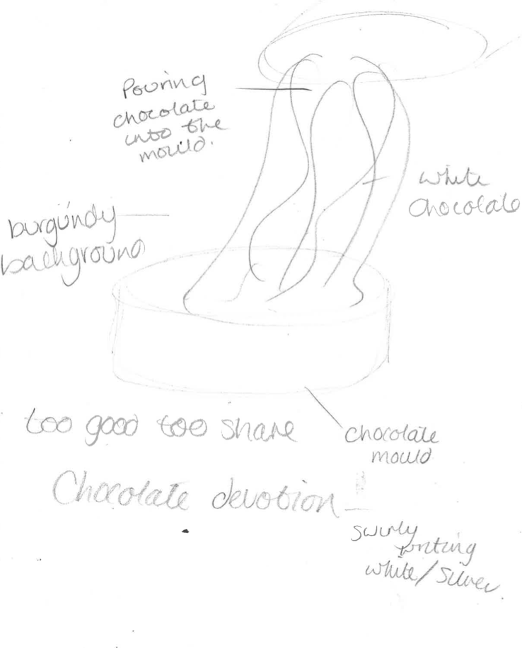
This is a piece of work done by Si Scott. I think he has done his work digitally using adobe illustrator and also by hand drawing it. In some of his work he uses a gradient in colour, he starts with a dark colour on one side and get lighter throughout. The colours also blend together. The shape of this work is swirly and circular. The lines are blurred and are both a mixture of thick and thin. The form of this piece is water like and fluid as the lines flow.
I tried to create my own Si Scott inspired piece on adobe illustrator, I typed 'your love is my drug' and then used the tools to warp & swirl the writing. I think this has added a unique effect to the piece & I dont think I added too much to the writing as its still readable & clear to read.