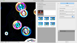
This was the picture i first decided i was going to use as my background but it took too much attention away from the article. I then used a picture of the converse as my background. I used a blue rectangle box and placed the page title inside it vertically. I added in the text in blue and kept the font simple and readable.
I then decided that i would change the text to green but as it was still hard to see against the background i decided that the text needed to be put on top of a different colour background box, this made the text stand out from the background but was a mix-match of colours. I angled the text box so the were diagonal and placed at different ares of the double page. I added in the matthew midgley illustration but the white background of the picture on the different coloured page background made the picture look too tacky.
I decided that i would rearrange the text box and add in my illustration in the style of matthew midgley. I added in different coloured stars that were different sizes and scattered througout the page. The text was added over my illustration to explain that it was my own work, I chose the colour yellow because it would stand out on top of the red and the white.
Final Illustration page
I kept everything the same for my final outcome but i changed the colouring of the yellow text to purple as it was bolder and stood out more against the other colours.


No comments:
Post a Comment