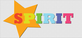
I decided that for my logo i would try the handmade techniques. I decided on the name spirit because of the fashion magazine and i thought that spirit would reflect the choice of outfits on my feature page. For the 2 pink spirit logos i used acrylic paint, the idea for the top right hand side logo was from what a spirit would be like which was why i added in the wings at the end of the word. The bottom right hand corner i used water colour paints i decided that i would look at going with a top of the pops style theme as most of my pages include bright colours and borders. I like the the watercolour logo although i think its a bit to messy as i couldnt keep control of the paintrbush. Therefore i decided that i would take that idea of that design and try it digitally.
I used the bold font, bright colours and star in the background i think it all works well together, i used the layer effect and added the embossed effect to the logo.


No comments:
Post a Comment